This week's assignments were very fun, very freeing, although I'm pretty sure burned out a little, I got so into it. Wrapping it up today with some 7" x 7" India ink paintings to add to next week. I'll probably wait to post those with Lesson 5. Here is my work and my posts for Lesson 4.
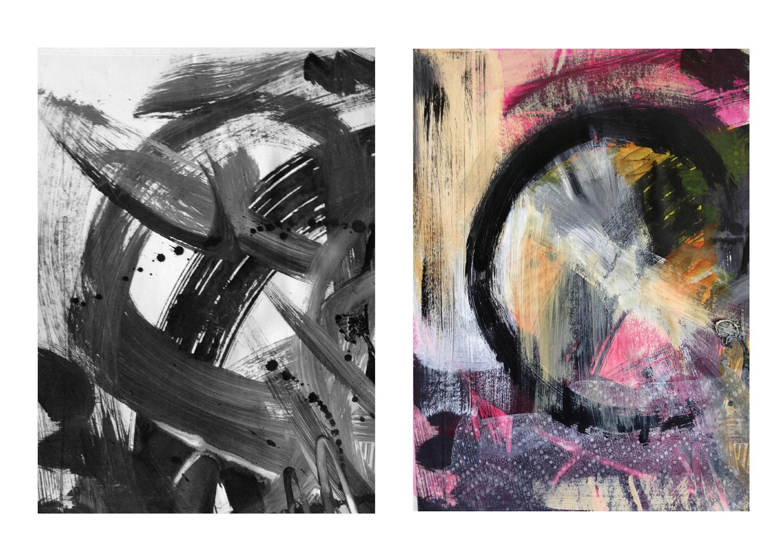
I really got into this and found it hard to stop. I loved painting
large–so wonderfully freeing–but I realized that I was ending up with a
lot of grey; not enough B/W contrast; need to work on this. And again
realizing that it is difficult for me to keep things simple. For this
reason I really liked applying the paint with the credit card. Here are
the large originals.
 |
| I added some white India ink over the paint here |


Then I cropped these and found so many great little compositions. But,
as I started to add to them, I found it difficult to start; feeling a
little too precious about adding anything. I was also finding that I
wasn't liking the pieces when I added color or other elements; didn't
quite know what to do. Also, I wasn't sure I even liked the little
compositions anymore. Then I watched the Working Large video and was so
taken with the way Jane worked with such abandon, such freedom (I
particularly liked it when you took the sheet of your palette with the
leftover paint and just pressed that onto the painting!) that I was
inspired to just go for it. So that's what I did. On many of these you
can hardly even tell what was underneath; I just kept adding things
until the piece looked like something moderately interesting. I became
obsessive about this and finally had to stop ( I still have more cropped
pieces but will have to save those for another day). I've arranged
these as side-by-sides so you can see the before and after.
 |
| Added black, white and a dab of red oil pastels |
 |
| Again oil pastels |
 |
| Oil pastels and I scribbled with a pointed skewer on right |
 |
| A combination of Windsor Newton water based inks and oil pastels |
 |
| Acrylic paint and some sgraffito |
 |
Mostly acrylic paint. I really struggled with this one.
Didn't like
the colors I started with so I just started painting.
The texture at
the bottom was the imprint left from the paper
towel after I blotted up
the white paint.
There's a lot going on here but it's one of my
favorites
with all the layering and texture. |
 |
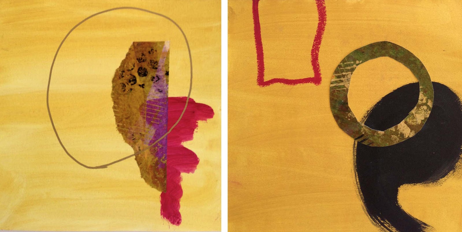
Acrylic paint, black conté crayon and collage. I extended this one
to the edges of the sketchbook just for fun. |
 |
| Black conté crayon, oil pastels and white acrylic paint. |
Here was Jane's comment; very insightful and motivating:
FABULOUS job, Arlene! Yes, there is a tendency to go gray if you move
black and white paint around too much. Trying to keep some pure black
and pure white forces you to be economical in your mark-making. GREAT
job on the large pieces and on the cropped pieces! You came up with a
beautiful variety of ways to amend the original black and white. SO
glad the Working Large video was helpful. It so often happens that we
start feeling precious and intimidated when working on a piece. It
takes real effort and commitment to let go of that and go for it. The
real key is to get in the habit of doing a LOT of work, so that you
gain: (1) confidence in the idea that there is always more where this
came from, i.e. your well will not dry up, you can always produce more
are, and (2) practice making art and resolving pieces. I still have to
make that effort to let go and not get precious, but it happens most
easily when I am working in quantity, working in series, and see each
piece as just another experiment, not A Precious Work Of Art. Noticing
that resistance and then making the effort to move through it is a HUGE
step. You did an awesome job!
Keep on keeping on; keep on experimenting --just the encouragement I need because I started to get a little frustrated again with the layered contour drawing exercise in this lesson... Here's my post:
I don't feel very successful in my results for this activity. Maybe I'm
just expecting too much. I also feel like I am struggling with color. I
did have fun doing the wet-on-wet self-portrait but then I don't really
like the way the contour drawing on the top looks—too heavy. Although my
husband said he likes it. Could just be one of those days...
No comments from Jane yet. I'll update when/if I hear from her on these.
UPDATE: Comments from Jane:
"Arlene, that self-portrait is amazing! I think the layered contours
show real exploration. You just begin to get some kind of interesting
stuff going on with these - the third and fourth show really nice
tension between the washy wet contour and the fine line contour. Then,
as I said, the self-portrait is fabulous! Excellent dynamic between the
washy wet and the crisp line.
Maybe you were expecting too much
from the layered contour. Remember the wet-in-wet and line pieces from
Lesson 3? You said you were out of your comfort zone on that one, but
you pushed through and came up with great combinations of wet work and
line. This is just a more directed version of that. Look back at your
Lesson 3 work and see if you can find something that excites you about
the pieces you made. Not necessarily as PIECES, as compositions, but as
examples of how line and wet-in-wet can create exciting conversations
together."
God bless her...