Friday, July 19, 2013

New Collage

On my way to Port Townsend to visit my Muse and take an abstract painting workshop with Jane Davies. Very excited!! My goal is to work on art everyday so here is a little collage I worked on yesterday and finished up today. It's a spread in my Collage Journal (I started this awhile ago using a kids board book). I posted the covers and one other spread in earlier posts.


 I should have more to post from Port Townsend this week.

Tuesday, July 16, 2013

Jane Davies Sketchbook Practice Lesson 6

This is the final Lesson from the class.

In just under the wire here. I have been working on these grids for about a week and a half. I really got into this last lesson, particularly Activity 2, and I've just run out of time. I am planning to do Activity 3 over the next few weeks.

For all of these activities, I struggled with paint and color but I learned a LOT and have figured a few things out; mostly I think I just need to practice more so that I am more confident in my paint strokes.

Activity 1—Closed and Open Grids

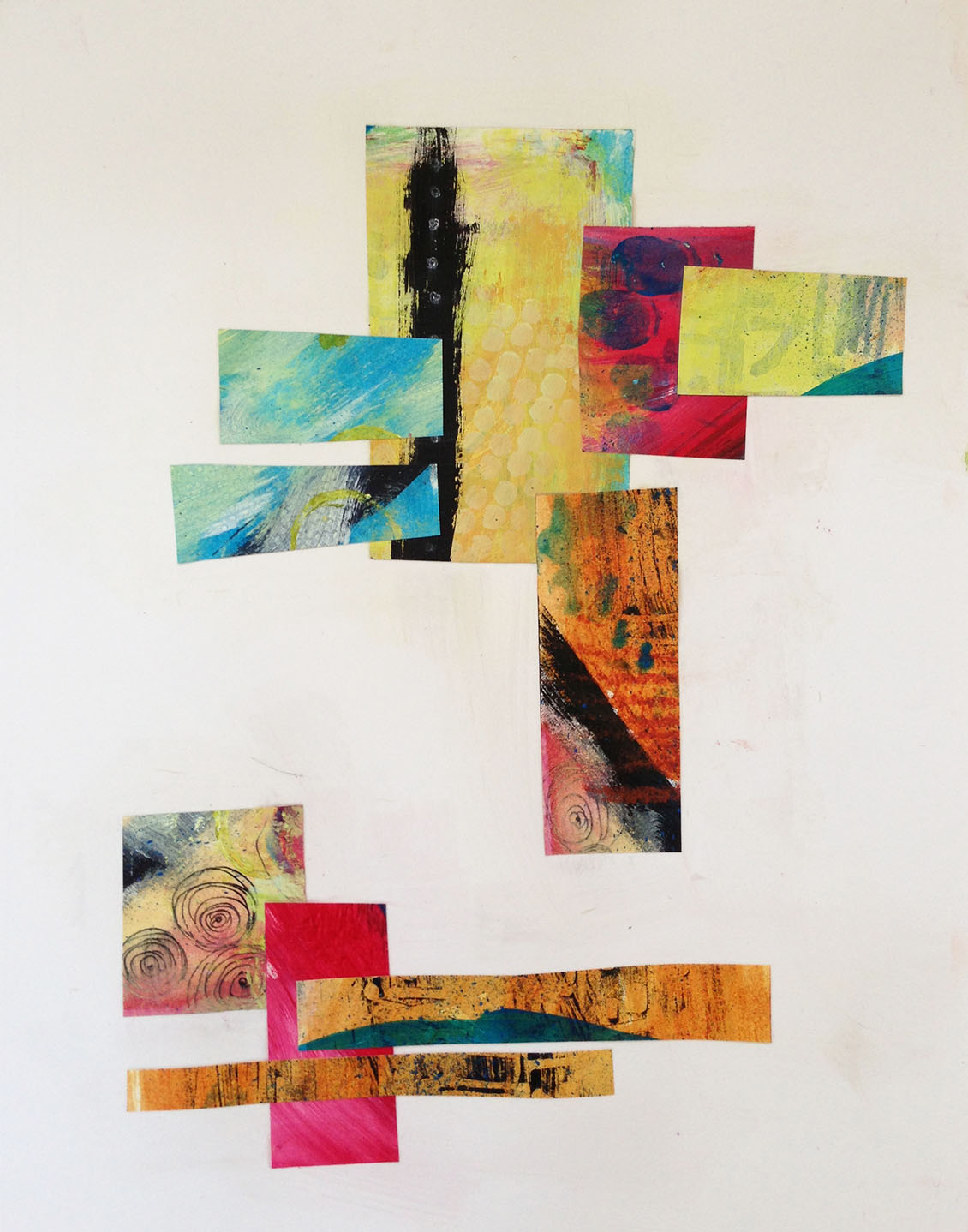
Closed Grid – collage papers

Closed Grid–pastels. I felt a little intimidated
about using paint and was more comfortable with
oil pastels. I worked with a color palette I'm
not completely happy with but I wanted to
try something brighter/lighter than I would
normally choose.

Closed Grid – acrylic and collage. I just decided
to dive in with the paints; simple blocks of color and
a variety of collage papers including tissue paper
and some hand-made papers. Also added a little
sgraffito and scribble.

Open Grid – acrylic and collage paper with some
bubble wrap dots. You can really see the struggle I had
with the paint here...

Open Grid – acrylic and collage paper. Here I kept
the paint simple (Quinacridone Nickel Azo Gold) and
did more of a wash. Then I added a darker layer
using a stencil. There were actually some areas of
black paint but they were too heavy so I
used some collage papers to cover them.

Open Grid – Quinacridone Gold again and Green Gold
with some large bubble wrap circles. I used some
stencils again. Wasn't wild about the colors at first but
when I added the collage elements, I ended up liking it.


Activity 2 — Reassembling the Grid

I really learned a lot from this, experimenting with paint, over-painting, textures and diverse materials/effects. Some of the original paintings seem a little busy but I wanted to create a lot of different areas of interest for the reconstruction. On the last couple, I tried to simplify (could be my new mantra) and I liked those too. But what I REALLY liked was reassembling them on the computer in closed grids. I like this so much I worked until midnight last night and was back at it a 7 this morning. I just love the way they all came out. And on so many of them, each individual square is it's own unique piece of art. I did these grids for all six paintings but I only had time to cut up four of them and make open grids. And I still need to go back in and add to the open grids but I am planning to do that at a later date. All pieces are approximately 9x12.

I added some iridescent gold circles, stencil,
lines from open flute corrugate, cork circles, white
gel pen scribble red dots from eraser tip and
black pattern from shelf cover material.


Here I added gold bubble wrap dots, cork circles,
white gel pen scribbles, a white grid pattern from some
woven ribbon I have and a little turquoise oil pastel.


Some of the same materials/techniques as above with
the addition of black fabric paint squiggle.


Mostly acrylic paint with some scribbles, a
little stencil, some white gel pen dots and some of
my finger prints.


This one really needs some background and additional
painted areas. I plan to add to this at a later date.


Same techniques/materials as above. I was trying to
simplify more here, which made the grid assembly more
challenging in some ways.


This was my last painting and I managed to keep it pretty simple
and yet create areas of interest through texture, color juxtaposition
and contrast.


Jane's comments:

Wow! Really great work on this, Arlene. Glad you were able to do the checkerboard grid on the computer so you could cut the actual pieces up into open grids. The original paintings are just perfect! Good examples of how interesting a piece can get when you are going for VARIETY, and not unity. Great job on the re-assembly, especially in the open grids. I think your intention to simplify in the last couple is well founded. You need some quiet space to make the busy areas come alive.

Oh, I forgot to comment on the Activity 1 pieces: very nice job on closed and open grids. Particularly nice balance of open space and pattern/texture in the open grids.

Also a nice comment from one of the other students:

Not to preempt the teacher; but your work is so impressive that I just couldn't resist to tell you this. The original paintings are so beautiful - the colors, the lines and the textures, all work together like a symphony. As a result the re-assembled pieces look so good. I love both versions. You inspired me. Thank You.  

This class was such a great experience and really helped to open me up and free me up. I am really looking forward to expanding on what I've learned here at Jane's Abstract Painting workshop next week. I filled and entire sketchbook plus two-thirds of two additional sketchbooks. Transitioning to artist's mode.

Jane Davies Sketchbook Practice Lesson 5

Activity 1 — Collage on Black Wash

I arranged these in the same order as I posted them in Lesson 4 for comparison with before and after.


Top Lft: B/W painted collage paper and oil pastel
Top Rt: B/W painted collage paper circle with acrylic paint/wash
Bottom Lft: Red/Gold collage paper with gold Sharpie lines
Bottom Rt: Blue checkered collage paper and white fabric paint scribble

Top Lft: Torn B/W collage paper strip with blue pastel.
I dropped this piece and it landed face down in some Quinacridone Gold.
At first I was alarmed. Then in the spirit of Jane's experimental
approach, I just smeared the paint and went with it.
Top Rt: Strip of colored collage paper and black felt tip squiggles
Bottom Lft: B/W painted collage paper and color collage paper w/cut out
Bottom Rt: Strip of B/W collage paper and red Prisma color scribble

Top Lft: Painted collage paper and metallic gold bubble wrap circles
Top Rt: Color collage paper doughnut and blue acryllic circles made from sequin waste.
Bottom Lft: I added the painted strip on the right first but then the piece
really needed a large, dark area on the left so I added a piece of B/W painted
paper I cut from previous paintings. The piece needed something more to integrate
it so I added a third element–the aqua watercolor pencil curved lines

Top Lft and Top Rt: B/W collage paper with acrylic paint and  wash
Bottom Lft: B/W painted collage paper with red pastel scribble circle
Bottom Rt: Collage circle of painted paper with white gel pen scribble


Activity 2—Working From Thumbnail Sketches


I learned a lot from this activity. I realized early on that I had chosen a weak composition that didn't offer me a lot of variety; the two shapes were too similar and not that interesting and the three elements didn't interact that well. But I decided to just go with it and see what I could come up with; how much could I vary the pieces in an attempt to make them look different. Because of this, I focused on materials and techniques, trying to create interest through colors and textures, and I really enjoyed this. It also finally made sense to me that these are "sketches," ideas and experiments not finished pieces so in some way the composition didn't matter; I could always fix this if any of these inspired me to do a finished piece. It also helped me to hone in on how to improve on composition in the future. So here they are along with the original thumbnail.


Oil pastels with printed rice paper

Acrylic paint with scribble sgraffito and collage paper

Acrylic paint background with hand made collage papers
and black oil pastel line. I had a layer of B/W collage paper
first that I didn't like and put new paper over these
so some of the B/W edges still show.

This is B/W acrylic paint background with collage paper
from our large scribble paintings and a gray and
white oil pastel line. I like this one because the shapes are
not as recognizable so it looks more like pattern. I painted
all these larger than the canvas size, going outside the
lines (something I NEVER would have done as a child)
and then cropped in for the photo. I included the
entire image below because I particularly like the rough
edge on this one; it gives it a different feel.

Acrylic wash background with oil pastels and some graphite
pencil. I again used some sgraffito in the shape on the left.
There is a smudge from the red pastel
that was not intended but what can you do; it is now
officially part of the piece.

Acrylic paint with white Prisma color pencil and black
oil pastel. I did a light wash of white acrylic, then blotted
some of it up with a paper towel to get the pattern on the
bottom portion of the right-hand shape.

This was a real stretch for me. Not my usual "style." I have
also forgotten how to work with watercolor, it's been such a
long time, so I used  this piece to begin to reacquaint myself
with the process (painful...I'd forgotten how hard it is).
I squiggled an arc for the line with white fabric paint.


Activity 3 — One-Line Blind Self-Portraits

I had so much fun with this I did several and added to some. I definitely got over wanting to look good! Some are more successful than others but I really enjoyed this activity and will continue to do this. I may even add more to some of these. I wish I had done all of these on heavier paper and with waterproof ink because now I am a bit limited on what materials I can use to add to them.

I experimented with starting my drawing in different places. One thing I noticed was when I started drawing the left side of my face, beginning with the eye area, most of the facial features were in better relationship to each other as far as position on the face; when I started with the eye region on the right side, the mouth always ended up higher, in the nose region.

This is one of my favorites, maybe because I added some
hair so I don't look so much like a man!


I added oil pastels to this one

Here are two I did with white and watercolor wash.
I used a white crayon for the one on the left. I used a Prisma Color
pencil for the one on the left. The image isn't as strong
but there was something ghostly about it that I liked.


Here are Jane's comments:

Activities 1 and 3—
EXCELLENT WORK! Arlene, you have done a great job on both of these activities, really digging in. You got fabulous variety in the paint and wash pieces - inventive and interesting approaches. The self-portraits are superb! You let loose and played with these - the additions are just great. LOVE the magenta afro you gave yourself. Fabulously expressive images, indeed.

Activity 2—
Excellent, Arlene! You got a TON of variety in this exercise, and you observed all the right things: how limited the sketch is, how the size and shape of elements is important, but can be offset by other aspects. I like the way you interpreted the curve as a line in some, and a shape in others, and interpreted the shapes as outlines in a couple of them. This is exactly the sort of exploration you can get out of a composition sketch.

Really great job here.

Tuesday, July 2, 2013

Rediscovered Inspiration

While I was working on a project for Jane Davie's workshop, I needed something heavy to flatten one of my pieces so I pulled out some of my art books. Two of those books were Richard Diebenkorn and Bay Area Figurative Art. What synchronicity! I had forgotten about these artists and I absolutely love this school of painting with it's representational and abstract style, rich colors and layered textures. Very timely because Janes's work has so many of these elements as well. So happy to have rediscovered these artists so I can weave their influence into my development.


Some of Diebenkorn's work